10 Things You Can’t Afford to Miss Out when Designing the Homepage

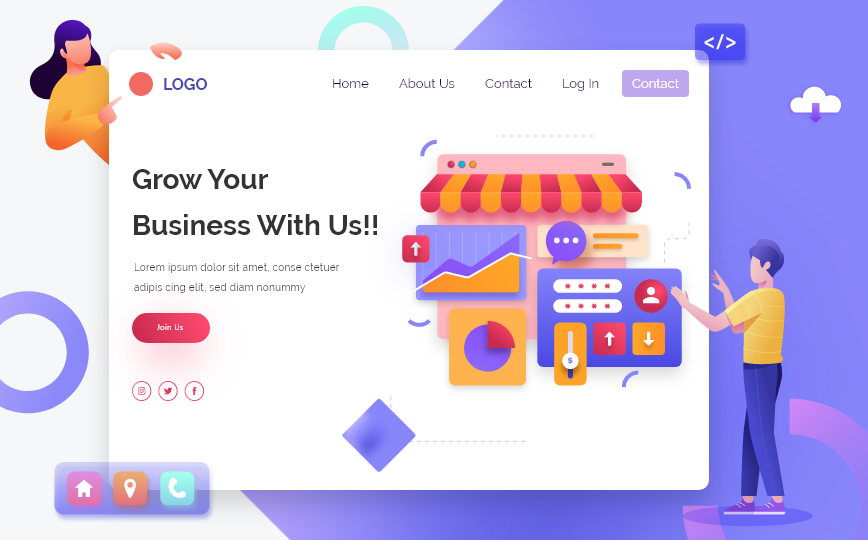
In the 21st century, a web presence is a must for businesses, irrespective of the nature of the enterprise. Be it a non-governmental organization or a commercial entity, having a well-designed website makes the purpose of the business, whether to gather more customers or to provide meaningful information, fulfilled to a great extent. When a visitor comes across the website, most likely they visit the homepage of the website and the homepage is just like the gateway to the world of the enterprise which provides an overview as well as the navigation compass to the visitor. Hence the businesses need to allot time and resources to design an attractive landing page as well as convey the brand message and image in a crispy way. This helps in catching the attention and encourages the visitor to navigate to the other pages. In this article, we shall discuss the design of the homepage and what are the most important components of the homepage.
1. Catchy Headlines
Whenever a customer lands on a page, the most looked at components are the headlines or titles. If the headlines catch their attention, they keep on reading the paragraph that follows. While it’s important to make the headlines which are usually header tags such as h1 and h2, at the same time, the h1 tags are important for search engines and must include the key phrase or a near similar keyword to convey what the content is about. Hence while writing the headlines it’s important to strike a balance between the catchy phrase as well as keeping in mind the relevance of the content.
2. Easy Navigation
Easy navigation is a must for the customers because they want to get the information they want very quickly. An easy-to-find main menu as well as a footer menu if they have scrolled down to the bottom are two components that a website’s home page must have in them.
3. CTA Buttons
Call-to-action buttons ( CTA) are very vital on the homepage of the website. Ideally, when a business wants to capture leads or provide a quick option for the customer to connect with them, A CTA button comes in handy. A well-designed and well-placed CTA button can bring quick leads. Especially when the business is running paid ads, CTA buttons are very important to include on the homepage. The CTA buttons not only guide and encourage the clients to take action but also build up a list of potential customers for future use.
4. Contact Information
The website must display contact information, such as email IDs, and contact numbers in a place that is easily accessible, and should be made clickable so that it guides the customer to the app for calling or emailing whether on a desktop device or a mobile phone.
5. Testimonials
A review or a testimonial reflects the reputation of a business. There are various ways to put testimonials of past clients or reviews of customers on well-known platforms. An API can be used to display testimonials on a dynamic platform.
6. Award List
If the business has won any industry-specific awards, that becomes a great opportunity to display them on the homepage. They not only create a good impression but also are linked to prestigious and authoritative websites, creating some impact on the SEO of the website.
7. Partnerships
Oftentimes, businesses partner with related companies to increase their scope of operations as well to increase their brand awareness and value. Placing them in an appropriate place attracts the attention of the customers and creates a great impact on their decision-making.
8. Social Media Buttons
It’s needless to say that social media plays a great role in bringing visitors to the website or a visitor who has visited the site may visit the social media pages. Some activities of the organizations which are not found on the website can be easily found on the social media pages. Various kinds of information such as informational, navigational, or transactional can be made available on social media pages. These social media pages should be subscribed to by the customers so that they get fast notification of any posts made. Hence displaying the social media buttons on the homepage is necessary to encourage the customers to like and subscribe to the pages or channels.
9. A Contact Form
In several instances, customers visit the website but do not navigate to the contact page. Making a compact version of the contact form helps capture the leads early.
10. Portfolios or Profiling Video
Depending on the age of the business organization, if several projects completed are available they can be displayed in the form of a short portfolio with a “view more” option. Alternatively, a profiling video to give an idea about the capabilities of the organization or USPs can be made available to capture the customer’s eyes.


